
New chart types - Maps, sankey, word cloud, matrix

We're launching a few highly requested chart types to Onvo AI. All these charts are fully customizable and can be generated by just prompting in natural language.
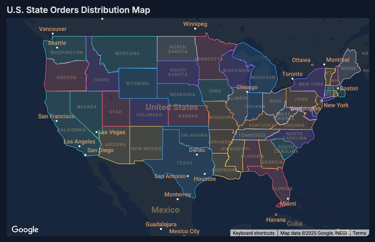
Map
This displays a world map centered around your points of interest. You can use this chart to plot points, lines and polygons on a map.
This chart was developed by the team at Onvo AI and in the spirit of open source, this chart type is built as an open source library. You can find it the link below if you are interested in using it in your own projects or contributing to it:
Sample usage
Create a map showing the different states of the US with their transparency scaled by the number of orders from the state
Sankey
A Sankey chart is a flow diagram that visually represents the movement of quantities between different stages or categories using arrows or links of varying widths. The width of each link is proportional to the magnitude of the flow it represents, making it an effective tool for illustrating processes, energy transfers, or financial flows. Sankey charts are commonly used to identify major contributions to a flow and areas where losses occur, helping to pinpoint inefficiencies or highlight key pathways in complex systems.
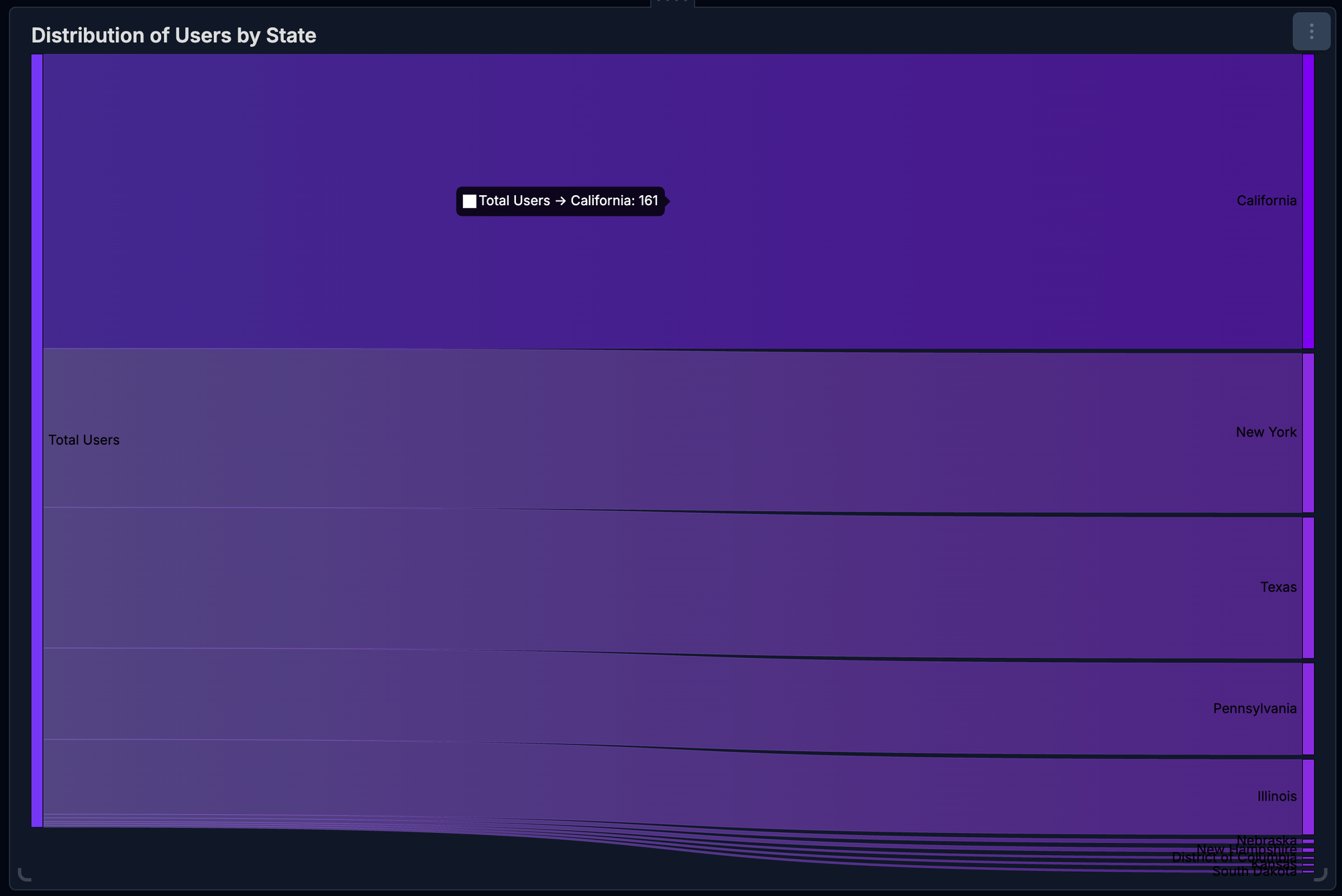
Sample usage
Create a sankey chart that shows the total number of users broken down into the states the users are from
Word cloud
A word cloud chart (also known as a tag cloud) is a visual representation of text data, where the frequency or importance of words is indicated by their size and sometimes their color. Words that appear more frequently in the dataset are displayed larger and bolder, while less frequent words appear smaller.

Sample usage
Create a wordcloud showing the different words in the blog post scaled by the number of occurrences.
Matrix
A matrix or heatmap chart is a graphical representation that uses a matrix layout to display data values as varying shades of color, making it easy to visualize the magnitude of data points across two dimensions. Each cell in the grid corresponds to a specific data point, with the color intensity indicating its value. This type of chart is commonly used to identify patterns, correlations, and outliers in large datasets, such as in performance analysis, correlation studies, and resource utilization tracking, providing a clear and immediate understanding of complex data relationships.
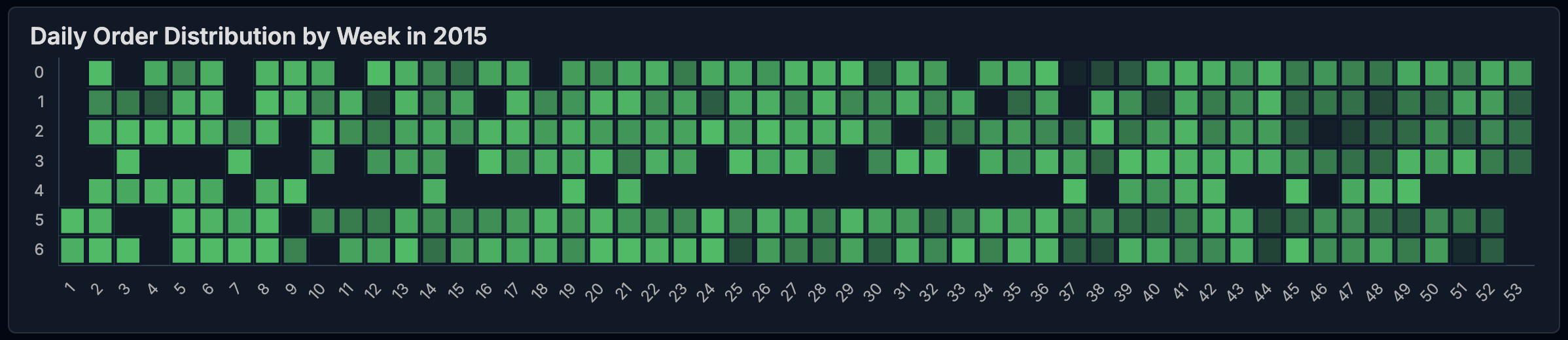
Sample usage
Create a heatmap showing the day of the week on the y axis and the week number on the x axis. Show the number of orders on each day in the grid.